|
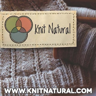
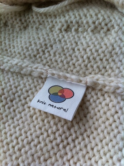
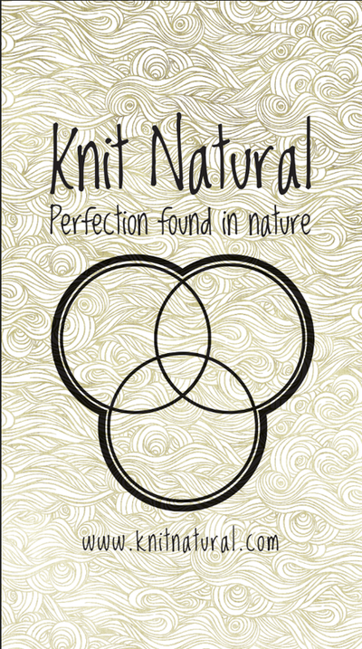
I've updated my logo slightly. I wanted a more natural look, and the colours in the Venn diagram are of actual sheep - including the blackish outline. This also creates a more unisex label to attach to my handknits. The font was and always is the hardest part. After looking through hundreds and hundreds of fonts which start to make "Knit Natural" look misspelled I think this one looks good on all accounts. I was going to use my own handwriting and make it into a font, but who wants to read that chicken scratch? I originally decided on the Venn Diagram because it encompasses everything I was looking for. By definition, these circles represent a collaboration of ideas or concepts which as a whole can come together or not. I am a spinner, knitter, crocheter, weaver, designer and more and I incorporate parts of these skills in each item I make. It is also a simple and clean image and much like my designs or projects I like to keep the "beauty in simplicity" moto in the back of my mind. 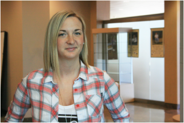 I am very lucky because my sister Nancy is my graphic designer. Her company is called Landlocked Design and she has done all my graphic work from my banners, tags, stamps, stickers and advertising. I am very lucky to have her expertise on my side. She also looks pretty damn good in Knit Natural! If you are looking for some work done from a simple ad to a full blown redesign of your business this is your girl. She can even tolerate my flip-flopping over every little detail, with re-assurance or new ideas. I am happy to see my business progressing forward and this updated look feels fresh and more centred around a natural theme.
3 Comments
|
Follow Me:PatternsCategories
All
Archives
August 2023
|







 RSS Feed
